


Next up in our cashless payments series our Digital Designer Tom walks us through how we created the brand identity for our micro payments app.

By Tom


This article is part of the Lockdown Look In series. You can read the first article Cashless Payments - Inspiration" here.
A strong brand is important for creating a memorable impression for users and lets people know what to expect from the organisation as a whole. Laying solid foundations helps inform our decisions about the product throughout the development and marketing processes.
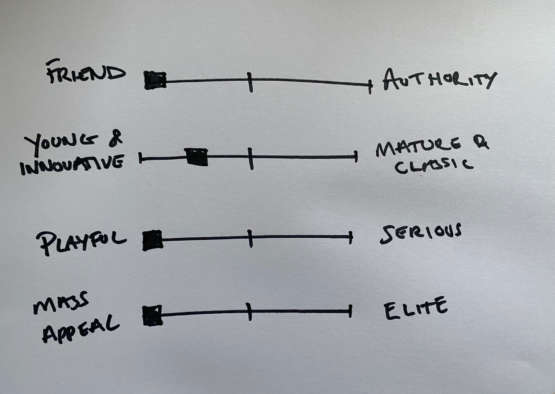
With that in mind, we established that the criteria for our new app should meet the following:
Part of the overall business plan was to find product-market fit and build a foundation of early adopters. Achieved by testing different use cases, reading the data / feedback, then pivoting where required. Therefore, it was important to have enough flexibility in the brand to be able to fit different scenarios.
With the initial use case being around tipping in hospitality and takeaway environments we started playing with words associated with that. Breaking up the word "gratuity" we landed on Tuuti (too-tee). This provided a short, catchy name that could be used as a verb - "I'll tuuti you!".
Interestingly, the name divided our internal team to begin with. We decided to gather some valuable feedback externally through market research, and upon placing it in front of a number of users the brand received great feedback, giving us the confidence to progress.
With the name solidified, we started thinking about the logo and how to capture the criteria for the brand that we set out above.
The key breakthrough came when thinking about how we could break up the word "Tuuti" visually.
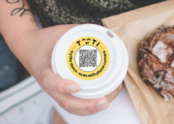
The key breakthrough came when thinking about how we could break up the word "Tuuti" visually. If you turn the "uu" upside down it forms the smiling eyes found in various emojis.
Emojis actually fit very well with the criteria we outlined for the brand. They're used in multiple environments, they have universal appeal - everyone can understand them and they're just an easy way to convey an emotion quickly.
Read on to learn how we landed on our icon below...

To move things forward we played around with some different typefaces and knew that we were looking for something clean, geometric and probably a near even stroke weight. Lulo Clean fitted this requirement well and gave a well balanced look to the logo.
We flipped the "uu" portion of the lettering, and added a simple mouth to form an emoji. The face could then be used in isolation as a logo when needed.
Colour choice was fairly easy - we just needed something that was going to punch out as a printed card or poster in any environment. Yellow suited the brand well, drawing on happy, positive emotions.
We added some captions to the brand to help underpin the friendly and good natured attributes we wanted to highlight. These were placed at key points along the journey of the app and marketing messaging.
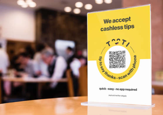
"You're awesome" is used on the confirmation page as a "fist bump" for making a tip. It's created with a hand drawn feel, to soften the brand and make it feel more human.

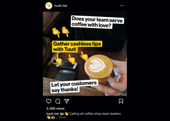
With the core product centering around scanning of QR codes to open up the payment funnel, the brand needed to reliably transition from digital to printed. The vivid yellow and the simple logo lent itself well to this, ensuring that it could stand out against any backdrop.
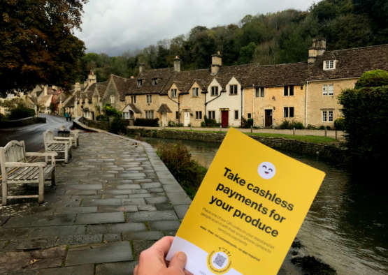
The brand was applied to various printed flyers and digital marketing channels.
We will talk about the tooling we used to develop our MVP for Tuuti - the micro payments app - stay tuned...